
What is so exciting about Oracle Data Visualization Desktop?
What is so exciting about Oracle Data Visualization Desktop?

About Oracle Data Visualization Desktop
Oracle Data Visualization Desktop,Oracle DV or DVD for short , is a powerful tool for personal data exploration and visualization in a simple per-user desktop download.You can quickly and easily visualize the data from multiple data sources by simply uploading the data files or connecting to a database or Oracle applications. Data Visualization Desktop also gives you the capabilities for self-service analytics, secured share and collaboration acoss the enterprise and a complete mobile experience
Data Visualization Desktop’s benefits include:
-
A personal, single-user desktop application.
-
Offline availability.
-
Completely private analysis.
-
Full control of data source connections.
-
Direct access to on-premises data sources.
-
Lightweight single-file download.
-
No remote server infrastructure.
-
No administration tasks.
In this blog, I have highlighted some of the interesting features of Oracle DVD with appropriate examples for better understanding.
Pause Data Queries in a Project
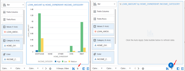
We worked with customers whose datasets were huge and when we tried to perform actions such as adding metrics, attributes, modifying filters etc., while on one hand we kept building visualizations, considerable amount of time was consumed to update and render the results. This is a constant issue while working with such voluminous data, but DVD helped us to handle it with a very cool feature called Auto Apply Data. You can use this feature to temporarily disable data queries or pause the issuing queries while you make changes to the visualization contents.
As you can see in the example, when the Auto Apply data button is enabled, the data queries are disabled and a bubble indicating the number of skipped data requests is displayed. Clicking on the bubble refreshes the data but the queries are still paused which can be enabled by clicking the Auto Apply data button again.
Drill to a data element or an attribute
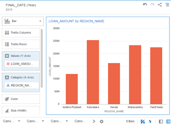
You might work with reports where you might need to drill down to the detailed level in order to get a better understanding and exploration of the data. Consider the below example screenshot, where our customer wanted to look at the region wise loan amount for a particular year. From the top-level - Year, the customer wanted to drill down further levels to region, purpose etc.
Oracle DVD comes with a set of analytic functions, one of which is drilling to a data element in the visualization or through hierarchies.
Select a data element (Year 2015 in the example) in the visualization, right click and choose Drill to Attribute / Hierarchy and pick a data element of your choice (Region in the example).

The below picture shows the region wise loan amount for the year 2015.
Connecting Visualization Canvases
Customers might also want you to link the related contents in a project. You may be asked to navigate between canvases within a project or another project, there might also be a need to pass information from one canvas to other. To do this, Oracle DVD offers Data Actions functionality to connect visualization canvases.
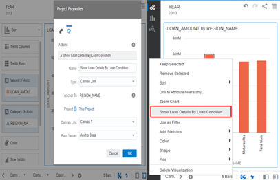
In the example, the customer wanted to view the loan amount in every region and also wanted to analyze the loan status, either good or bad in any/some/all the regions.
To achieve this, click Data Actions from the menu, add an action and its details and save the action. To invoke the data action, select the desired data element(s), right click and choose the data action as shown in the example.
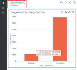
The below canvas shows the number of good and bad loans based on the region selected in the main report.
Pattern Brushing
Customers expect your visualizations to be as much interactive as possible. DVD gives us many handy and innovative features to present your visualizations and narrate your stories in an attractive manner. Brushing is one such feature which highlights similar data points on the visualizations when a particular data point is selected. You can toggle between the Brushing on/off by simply clicking the icon at the bottom of the canvas.
As you can see in the example, the data points for the particular region (Karnataka) is highlighted in all the visualizations when Brushing is on.
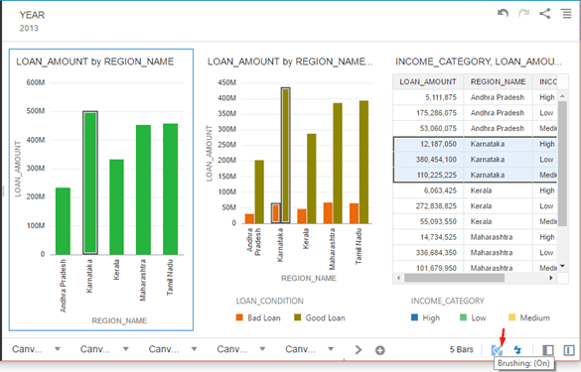
Use As Filter
Customers might want to use data points in one visualization and as a filter for other visualizations. You can achieve this by using the Use As Filter feature, which generates filters in the other visualizations of joined data sets and matched data elements. Select the visualization to be used as a filter, right click and choose Use As Filter.
In the example below you can notice that when the data point Andhra Pradesh is selected, the rest of the visualizations get filtered out for the same data point.
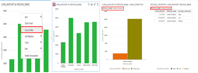
Note that a filter icon is added in front of the visualization title to indicate that it is used as the filter for other visualizations.
Explain
While working on a data science project you may face several roadblocks along the way, Predominantly the ones you come across while inspecting your data. This includes having a clear picture of the data provided, regardless of its nature and volume, identifying the anomalies, correlations and distribution of the data before you can get going with the model creation process. This is no simple task as the volume of the data is proportional to the time consumed for understanding them.
This is where the Explain feature comes in handy. You can use the following components of this Diagnostic Analytics (Explain) to show patterns and uncover hidden insights in your data:
- Basic Facts – Shows how the data element is distributed in the data set and its breakdown against each measure.
- Key Drivers – Shows the data elements that are highly correlated to the outcome for the selected data element.
- Segments– Shows the segments or group in the dataset that can predict the value of the selected data element.
- Anomalies– Shows the group of anomalies or unusual values in the dataset relative to the selected element.
Note: You must install the Data Visualization machine learning component to display the Explain option
As shown in the below example, we were able to identify the outliers present in a column more effectively using the Explain feature in our project.
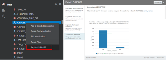
There are many such unique and interesting features in DVD. To know more about DVD and other Analytics features, click the link https://www.oneglobesystems.com/data-visualization
Leave your thought here
Your email address will not be published. Required fields are marked *